Sunday 23 June 2013

Boom. PJs.

This has to be my fifth incarnation of this pattern. Buzz up a medium, add buttonholes for ribbon, finish seams. Wear to bed.


Almost not worth blogging about, except that it's two more stash fabrics busted, a very last minute entry for Karen's pyjama party and progress on using up the epic London swap haul (thank you provider of green bleach-stained ribbon!).


Saturday 22 June 2013

The Barenaked Collection: Boomerang

This is my second project in the Barenaked Collection, and I'm giving up on the majority of the puns. The dress is the second of the two projects I had to complete in One Week. Though that was six weeks ago, how time flies!

Know that it's named for the newest BNL single because it's cheerful, summery and because of the line 'despite the pretty dress and curls, you don't throw like other girls'. (Obviously, I throw like an old man.). I'm working my way through Grinning Streak at the moment, so do expect further Barenaked pun outfits in the future (obviously have to make something fabulous to wear when they next tour the UK!)

Anyway! So the dress is based on the Burdastyle 02/2013 Paule Ka dress. I'm a bit mad for cowls and this one was really striking, if a little too pristine in the original style. I traced a 34 on top, moving out to a 36 below the waist. Apart from adding short kimono sleeves and moving the zip to the side seam, I didn't make any pattern adjustments. This was more a case of being stubborn and flying blind rather than a question of good fit.


I began tracing the pattern during a power cut and after struggling to see the green lines by the light of a Glade scented candle, decided it wasn't worth it. Once the pattern was finally traced, the structure of the dress took about a day to come together. Most of that time was spent trying to figure out the instructions for the drapes at the neckline, they're not clear at all (thanks burda) and I ended up basing the pleats on another blogger's photos. They ended up pressing really nicely.


Don't tell anyone but I was furiously finishing this on the train, getting the hem in a muddle and taking 2 hours to insert the zip by hand. It definitely looks better than my other invisible zips (that almost sounds like an oxymoron) so definitely shows that practice is paying off.


The dress is made from blue linen from Goldhawk Road and lined in a light silk (for some reason I'm convinced it's a habutai). I love both of these fabrics. The linen is really spongy which makes any drapey effects look quite funky. I was keen to have an outer with a visible but subtle weave to show off the bias/drape area. Plus, M&S says blue linen is in this summer. The silk has an amazing mix of green and black threads. The whole dress does crease like a bugger though.

The dress has held up well during its first outing, but I've stressed the lining seams a little bit and will have to go back to them in the future to mend them. I also need to make a proper sash and bow/flower for the dress too. 


I've used a scrap of lining that works well as a colour, but I'd like to come back to it and make a few possible options. The original idea was a tulle/netting sash with an oversized flower to rival the front drape and break up all of the blue. Plus, the change in texture is really interesting and might let the cowl be pinned in different directions, like you can see above.


So there are definitely a couple of things to revisit, and I definitely need to wear this more often! Any suggestions for sash options?


Thursday 20 June 2013

Let's Twist Again!

I made the Twist & Drape top again! Much like the last version, this one is based on a pattern from Natsuno Hiraiwa's book Shape Shape.


It's made in some sort of drapery loose-weave fabric that I pilfered from the London swap in April. This was the only piece of fabric I knew instantly how to use, so thank you whoever left it! The drape is a little limper than the previous version. I like it a lot, the cowl/twist falls in a very different way and it's a lot easier to leave this one a bit messy. The colour is gorgeous, it's almost a sea blue. In some lights it's very blue, some lights it's a husky grey colour and in some it's almost green. What a great bit of fabric!

This time I used much smaller buttons. I like how they're near invisible on this top, but it would have been nice if they were added with a contrast thread.

The pattern stayed the same. I'm thinking of making the top a third time and adding some kimono/grown on short sleeves. Good idea?

Also, I'm still a little cheesed off with the pattern. The flat felled seams won't stitch straight and the bias tape never looks good. What is going wrong? Fabric just keeps shifting around under all of the curves. There has been a lot of rippling and ripping. Grrrrr.

The next version will probably have a contrast effect so I want to get this neat. Has anyone else attempted this pattern? Generally any tips for making these curves look pristine?

Should I just line it?

Tuesday 11 June 2013

Chic Expectations - Eep! We hit six months!


The problem with most people who sew is that we go for fabric like other people go for shoes, DVDs, Apple products, sexual partners or, heaven forbid, actual items of clothing. And then, when a big project comes along, we find ourselves looking at our stash piles, throw up our hands and say "but I've got nothing to sew with!". Which is where my current great problem lies, and why nothing in the stash...or in the many shops I've been to for advice have been able so demonstrate they're a good match for what I have in mind.

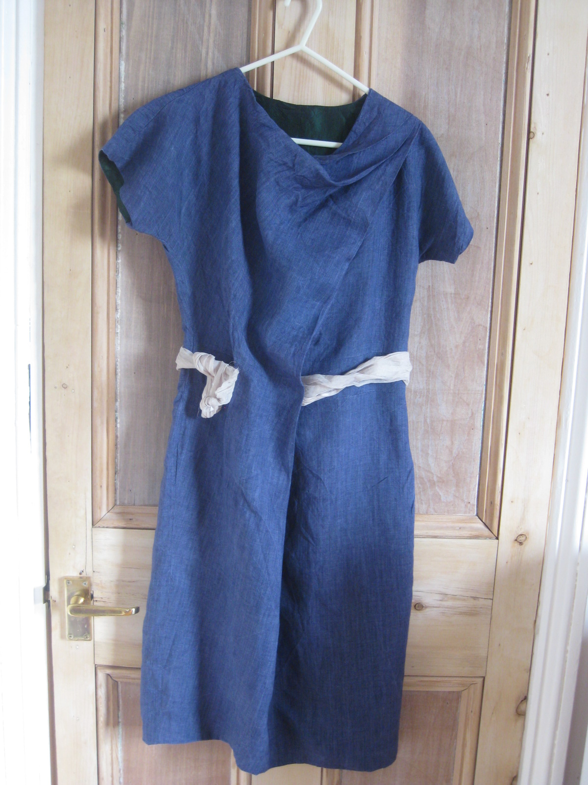
Just as a reminder, here's the line drawing:

I've gone through several people, suggestions and ideas for fabric, all of which are probably acceptable, but not quite right. It's all fine, but the whole point of ripping off reinterpreting this dress is to be needlessly ostentatious. It should be recklessly extravagant and almost definitely make you and those around you question why you're putting so many hours in to it. It should categorically not look like anything else out there. Take it to extremes and be tastelessly aggressive. If this dress could talk, it would sound like Brian Blessed.

I have pondered this question ever since I saw the pattern. What on earth should it look like?

Joel & Sons has just opened its online store. It would have been one place to find some exquisite print as inspiration. It was one thing to gawk at their fabrics without knowing the price. Knowing the money at stake is a very very different thing.

But now I finally have an idea. It's an irrational and wild idea. It's broadly solid colours. It's going to take time and an awful lot of effort. It's going to be a steep learning curve, but I can't get it out of my head, and it's definitely the right thing to do. Think peacocks. Think poppies. Think art nouveau. Think gobos.


I've been using all the inspiration I can find to draw these ideas together. There are a few things that seemed to be important to capturing the spirit of the dress/design: bright colours, diagonal lines, hand finishing/intricate embellishment. These are points I really want to keep.

The silhouette of this dress is fairly classic, but it's the seam lines and the straight lines in the print that makes it look modern. Digital. Jagged. Edhy. That's something I want to change.


Let's take it back in time and make it a lot more organic, soften all of the lines, tweak the colours. Let's add texture not through the layered print, but through appliqué, reverse appliqué and beading. Let's base the curves on my art nouveau calendar, the extravagant houses in Brussels and a dining chair from the Vienna Museum of Applied Art.

These are the colours we're looking at

The one concern about this design is that the seam lines might get lost under the embellishment. Is there any point making this dress if those details are hidden? Or am I just creatively making use of them in the background?

What do you think?  Now to find the fabric. I'm off for a look around Goldhawk Road. A good long look.

Until next time.